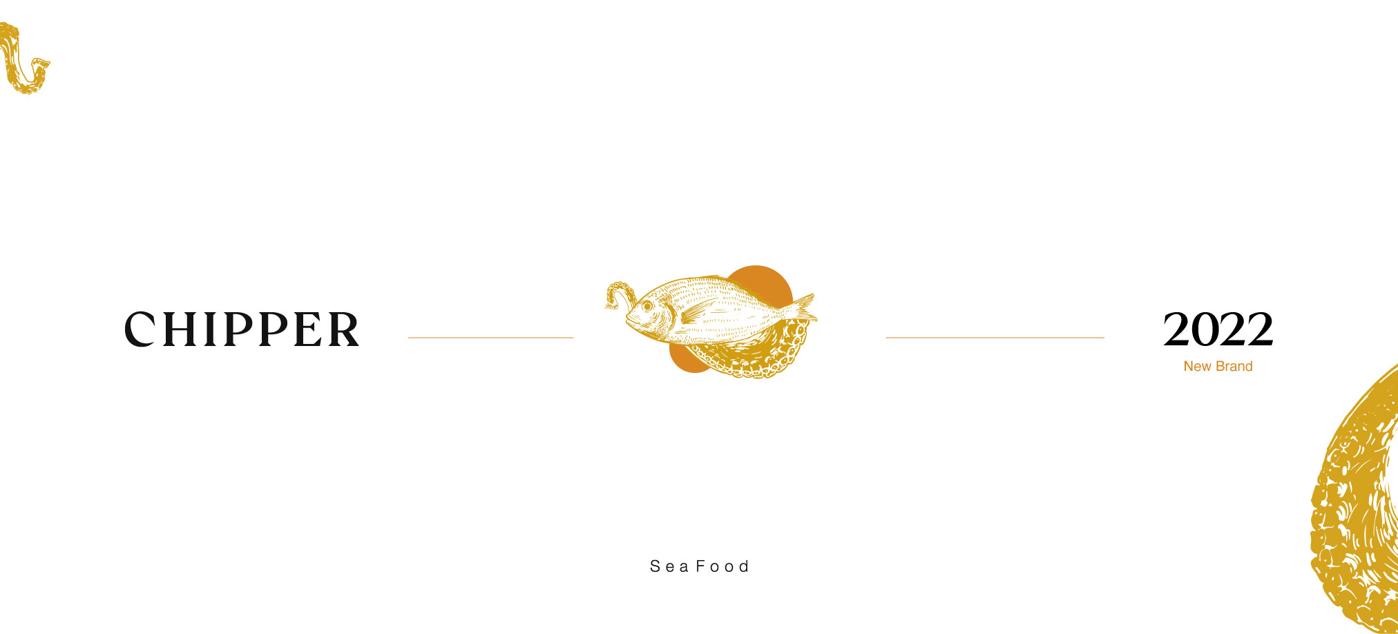
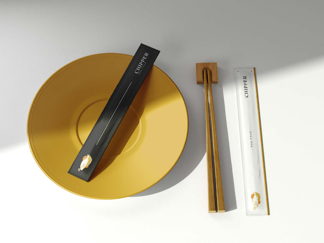
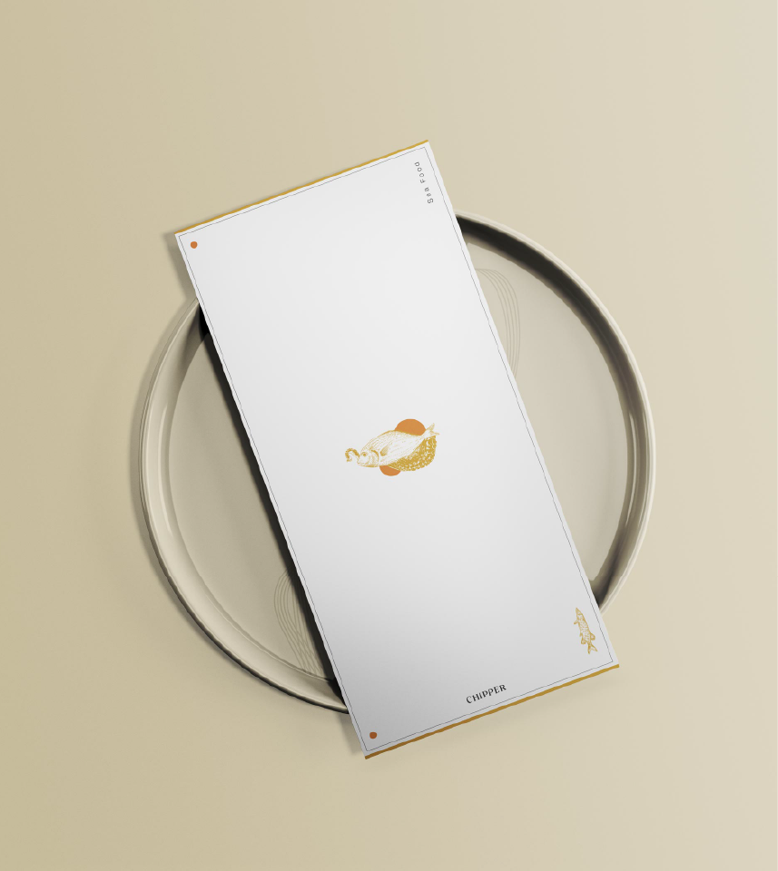
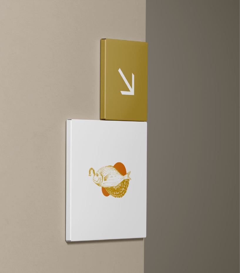
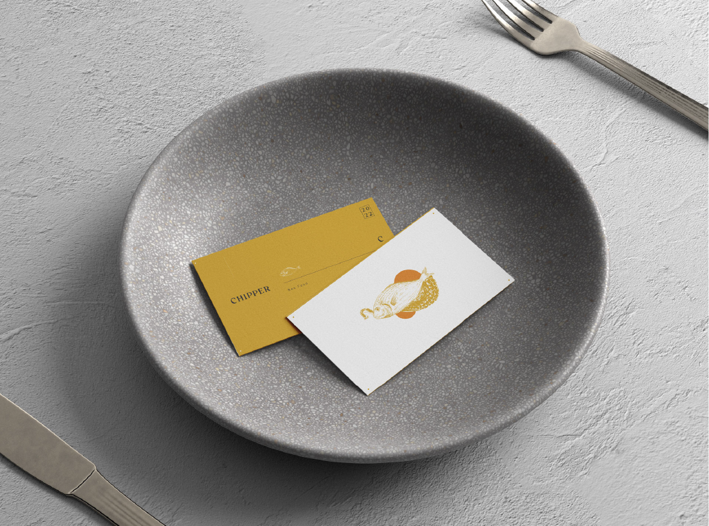
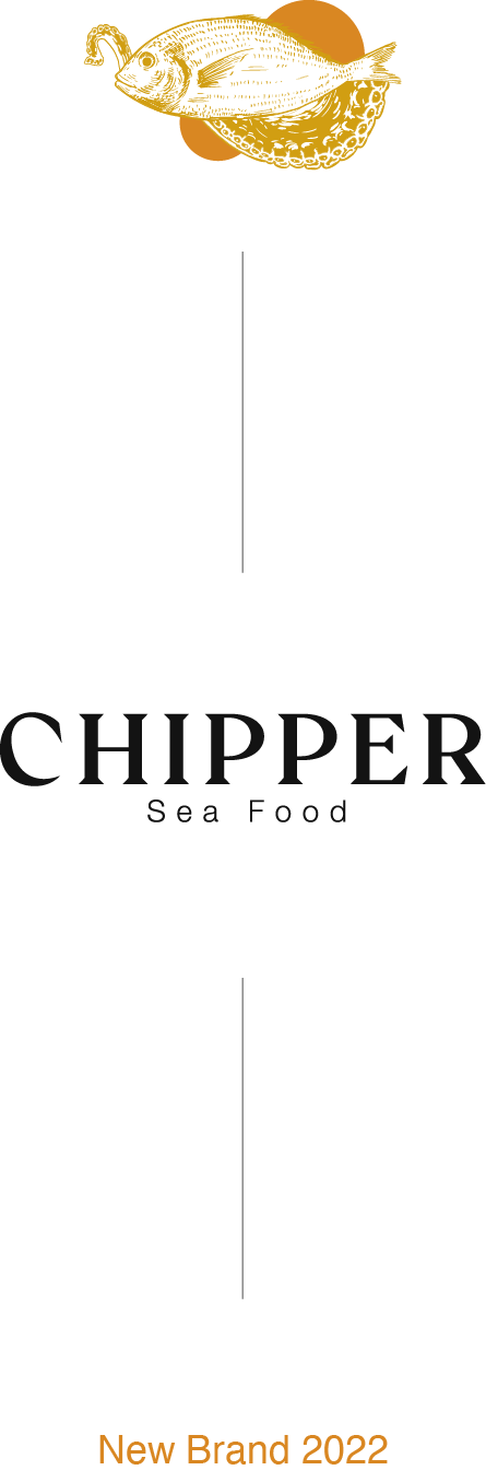
Chipper
Success Case and an Exciting Brand Redesign Project for Chipper. A restaurant located in the Palermo Hollywood neighborhood of the Ciudad Autónoma de Buenos Aires. I’ll take you on a journey of visual and strategic transformation that redefines Chipper’s essence, elevating its identity to new heights. I’ve merged legacy and elegance with a contemporary and appealing aesthetic that will position it as an elite destination in the city’s culinary scene.

Before

After
Typography
For the Chipper brand, two typefaces were used to open up the brand’s visual ecosystem. Both function effectively together, allowing for proper contrast and interesting visual possibilities.
Crucial
Medium version

Main font
Helvética
Regular version

Secondary font

Color
#D19E12
RGB 10, 158, 14
#FBBD17
RGB 252, 190, 36
#D3A00C
RGB 214, 161, 15

Thank you for dropping by