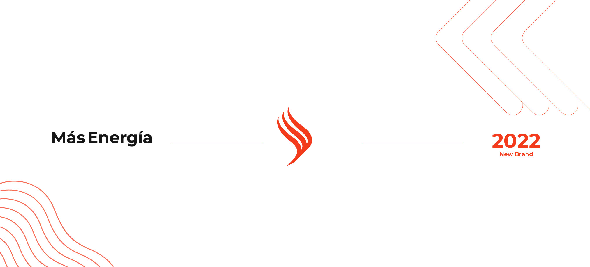
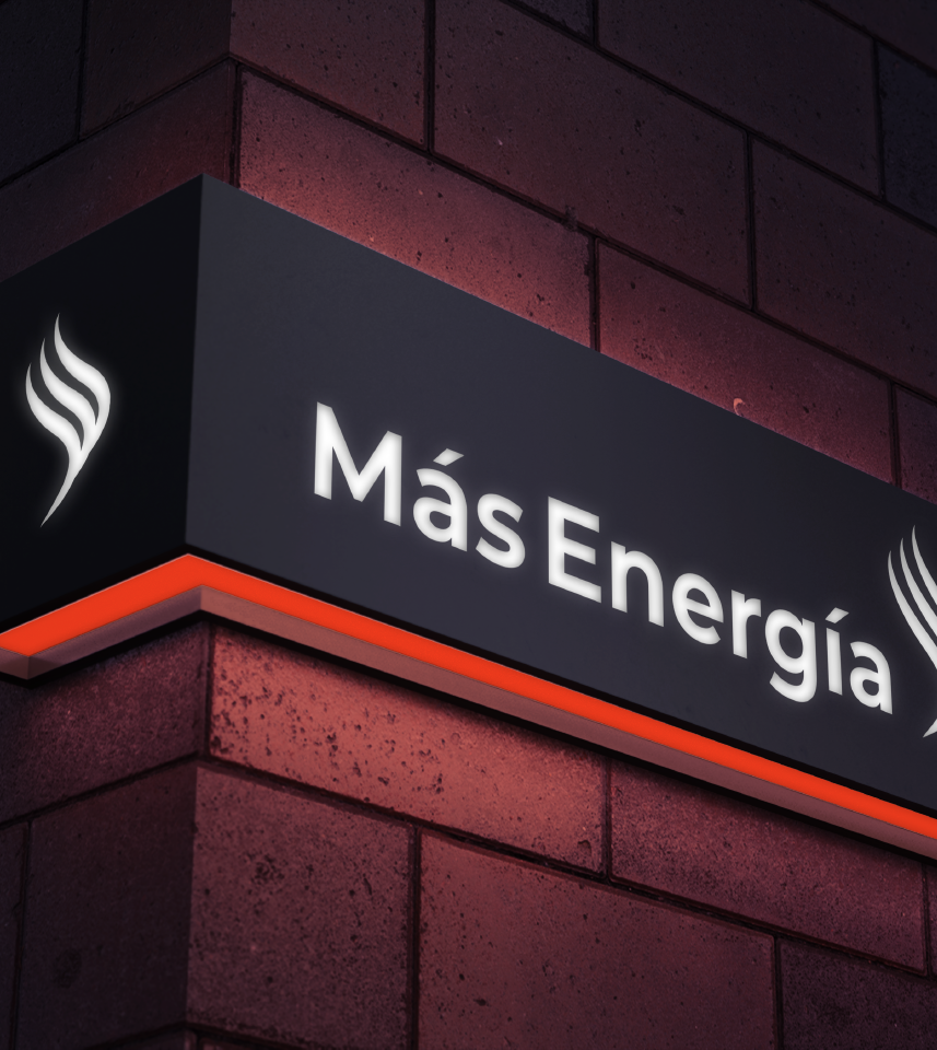
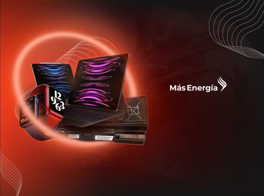
Más Energía
The branding project aims to revitalize the company’s image, emphasizing innovation, sustainability and commitment to the customer. Through a modernized visual identity, compelling communication and enhanced customer experience, the project seeks to position «More Energy» as a trusted leader in the battery sales sector, fostering growth and positive impact.

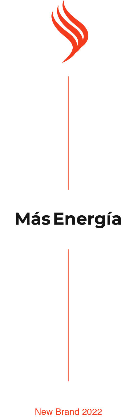
Logo
Typography
Montserrat: Chosen for its versatility and modern elegance, Montserrat typography embodies sophistication and accessibility in branding. With its clean lines and balanced proportions, it communicates professionalism and clarity, reflecting the brand’s commitment to contemporary design and effective communication strategies.
Montserrat
Bold version

Logo font
Color
#F33B1D
RGB 243, 59, 29
#191919
RGB 25, 25, 25

Thank you for dropping by