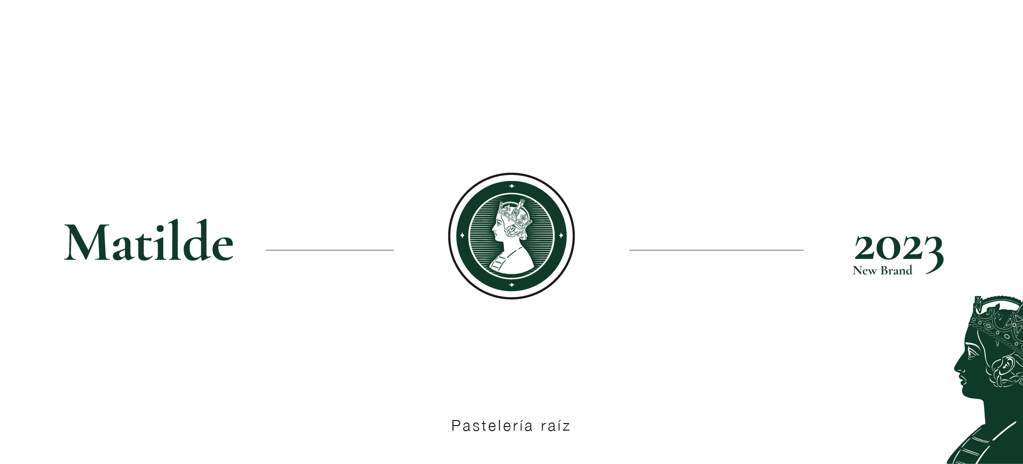
Matilde
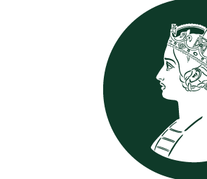
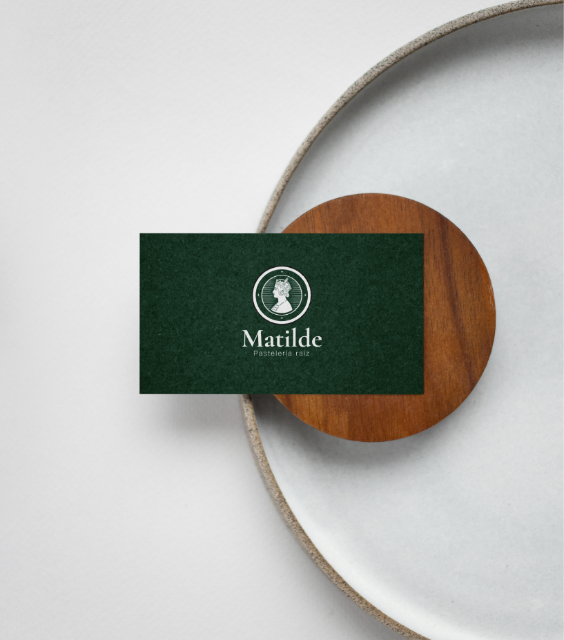
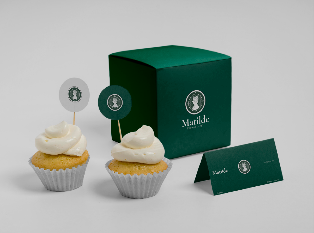
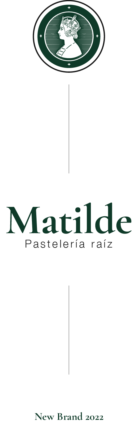
Matilde is a sublime representation of the elegance and opulence that characterize this brand. We highlight a stylized profile of Empress Matilda, paying homage to the inspiration behind the new symbol. Matilde’s image is surrounded by delicate details that evoke royalty and sophistication. Additionally, it is presented in a refined serif typography, providing a sense of legacy and prestige. This logo embodies the essence of Matilde: luxury, quality, and a tribute to the empress who personified excellence.

Logo
Typography
For the Matilde brand, two typefaces were used to complement the brand’s visual ecosystem.
The Cormorant Garamond typeface is an elegant choice. It features delicate and proportioned letters with soft serifs. Its design evokes a sense of sophistication and readability, making it an ideal option for this project that required a touch of refinement.
Cormorant Garamond
Versión Bold
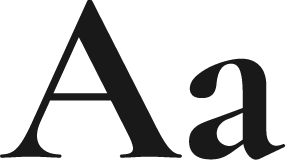
Main font
Helvetica Neue
Versión light 45
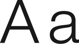
Secondary font
Color
#0f3A29
RGB 15, 58, 41
#191919
RGB 25, 25, 25

Thank you for dropping by