- Role
- Brand experience / UI Designer
- Year
- 2022
- Location
- Palermo Hollywood, CABA
Chipper
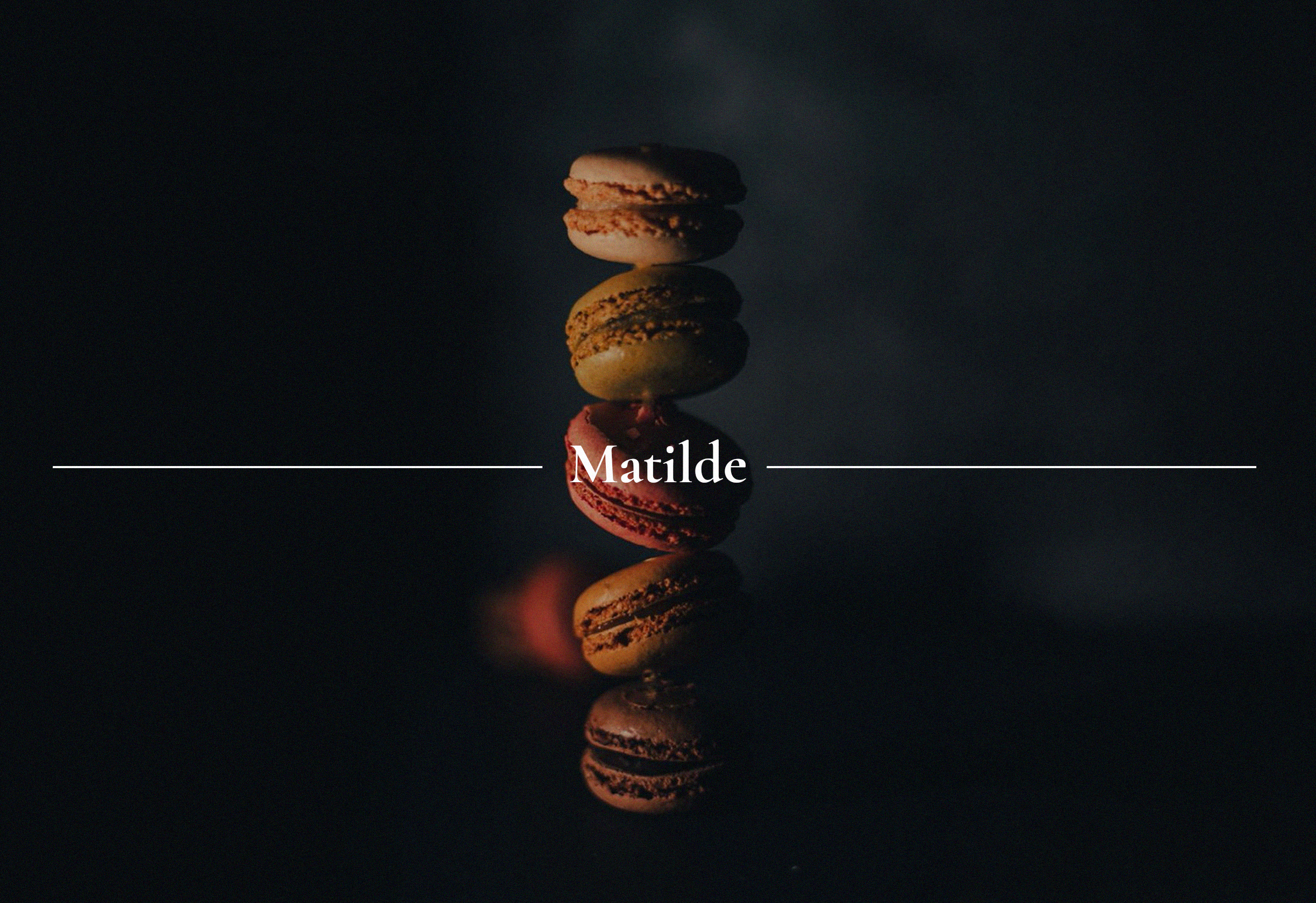
Success Case and an Exciting Brand Redesign Project for Chipper. A restaurant located in the Palermo Hollywood neighborhood of the Ciudad Autónoma de Buenos Aires. I'll take you on a journey of visual and strategic transformation that redefines Chipper's essence, elevating its identity to new heights. I've merged legacy and elegance with a contemporary and appealing aesthetic that will position it as an elite destination in the city's culinary scene.
The palette
Two warm families.
With blue off the table, the system commits to warmth — a saturated gold for the brand voice, balanced by a complementary orange that adds appetite and personality across every touchpoint.
Primary
primary/principal
color/gold/500
#D29E0E
primary/dark
color/gold/700
#705408
primary/default
color/gold/400
#D6A10F
primary/light
color/gold/300
#F0B411
primary/lighter
color/gold/200
#FCBE12
Secondary
secondary/principal
color/orange/500
#DA8824
secondary/dark
color/orange/700
#704613
secondary/default
color/orange/400
#D68624
secondary/light
color/orange/300
#F09629
secondary/lighter
color/orange/200
#FC9E2B


Visual approach
A constraint shaped the project from the start: a direct competitor already owned blue — and seafood, almost by reflex, calls for blue. We had to step away from the obvious and build a palette that still felt aquatic without leaning on the cliché.
The answer is a duality — a deep ink-toned stage that grounds the brand in tradition, paired with hand-drawn marine illustrations and a warm gold accent that bring warmth and personality. A classic high-contrast serif wordmark anchors the identity, while a curated set of orange line-icons — fish, lobster, nigiri, ramen, sushi — translates the menu into a recognisable visual language across every touchpoint.

The result
Chipper now stands out in a saturated Palermo Hollywood dining scene — recognisable, confident, and unmistakably its own. The new identity gives the restaurant a visual language flexible enough to grow with the brand, while preserving the legacy and warmth that made it special to begin with.

Continue exploring