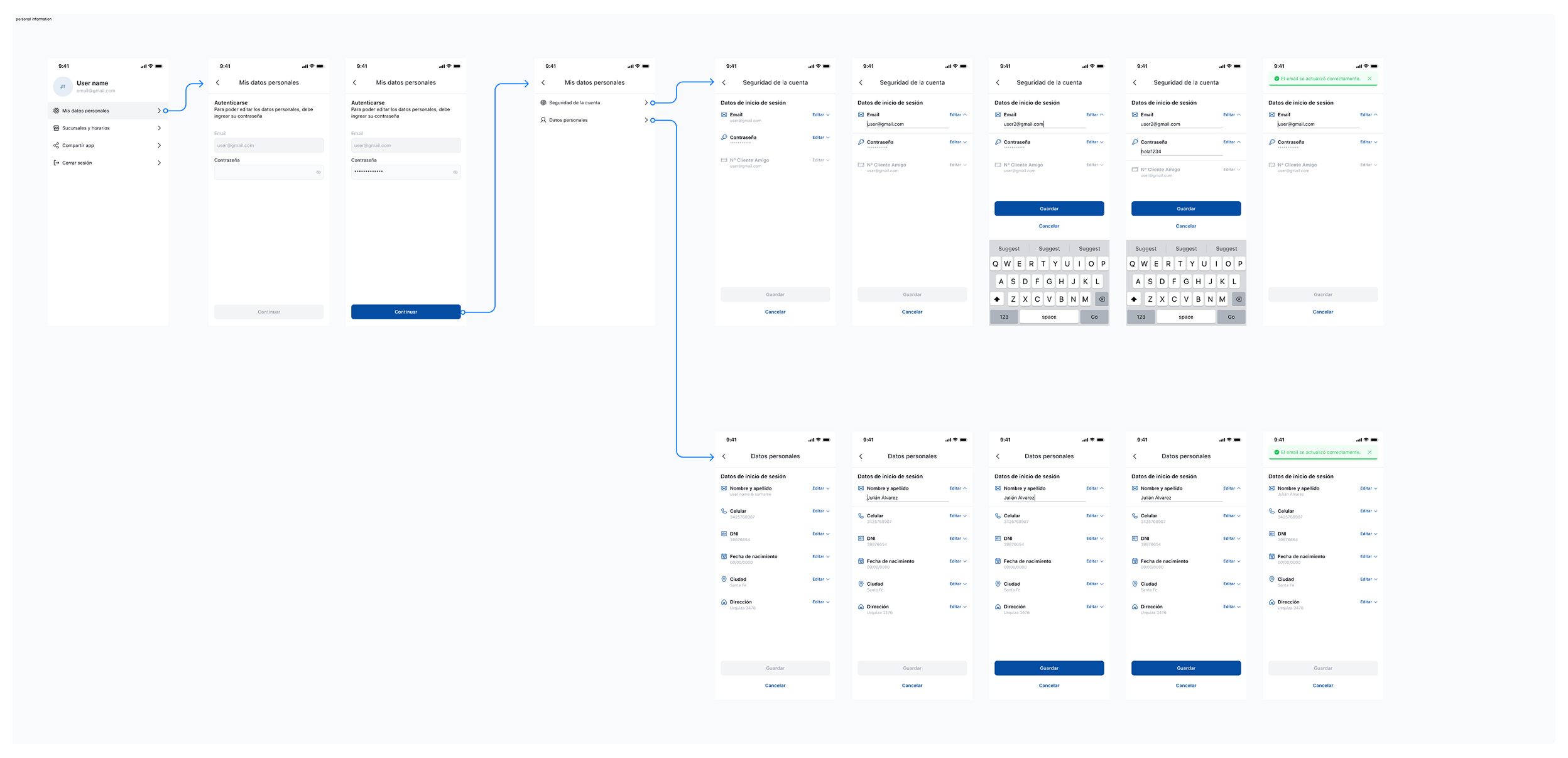
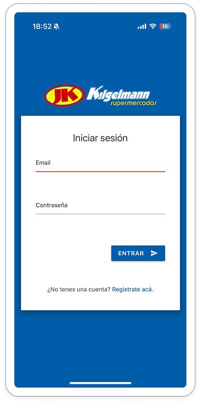
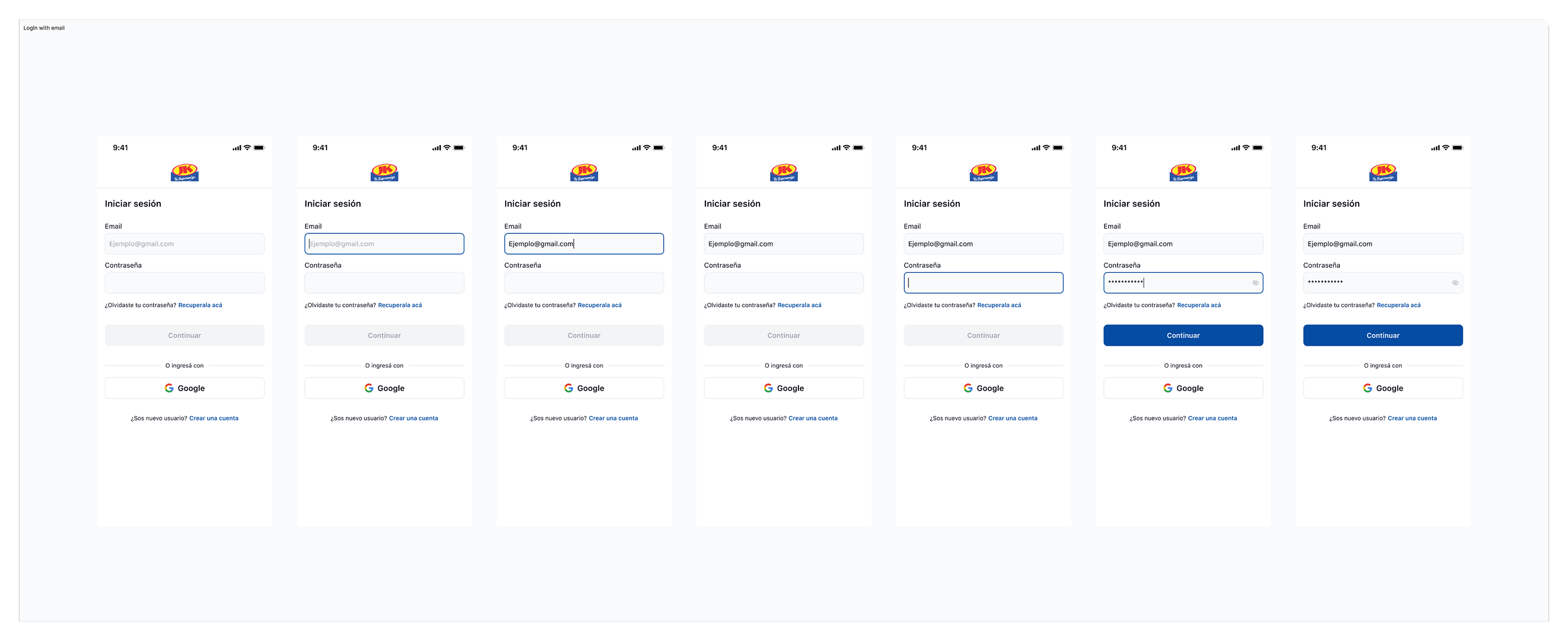
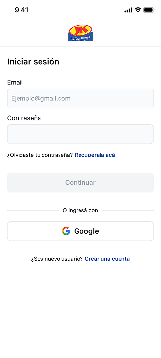
Julian Tur
All work
JK Kigelmann logoJK Kigelmann — capsule
Role
UX/UI Designer
Timeline
6 months
Scope
Identity · Components · Guidelines

JK Kigelmann

This project focuses on the development of a redesign Design System aimed at ensuring visual consistency, design efficiency, and product scalability. The system defines clear identity guidelines, reusable components, and usage rules that facilitate collaboration between design and development, optimizing workflows and maintaining a consistent user experience across all touchpoints.

Before vs After

Comparing the original log-in screen to the redesigned version — what was broken, and how each issue was resolved.

Before — original log-in screen

Before

Issue identified

Original log-in screen

The first version of the log-in screen had several usability issues that slowed users down and made the flow feel unfinished.

  • Small Log In button.
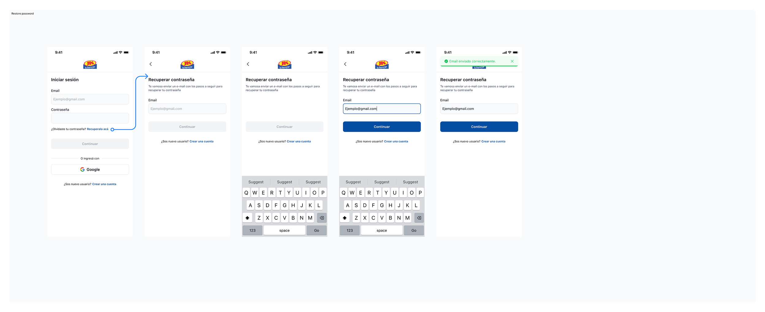
  • Missing “Forgot password” feature.
  • The layout of the elements does not take advantage of the maximum height of the screen.
After — redesigned log-in screen

After

Resolved

Redesigned log-in screen

The redesign addresses each of the issues above, making the log-in experience faster, friendlier, and better adapted to the full screen.

  • Increased button size.
  • Added a gentle feature to recover the password.
  • Layout of elements optimized for the best screen design.
  • Added an alternative log-in option, taking advantage of the maximum height of the screen.

Building and scaling the Design System

Typography

The typefaces chosen for this project are the native fonts of each operating system: SF for iOS and Roboto for Android.

  • 01

    Title

    1. Title

      18Bold24

    2. Subtitle

      16Bold24

    3. Subtitle

      16Regular24

  • 02

    Body

    1. Body

      14Bold20

    2. Body

      14S/Bold20

    3. Body

      14Medium20

    4. Body

      14Regular20

  • 03

    Captions

    1. Captions

      12Bold16

    2. Captions

      12S/Bold16

    3. Captions

      12Medium16

    4. Captions

      12Regular16

  • 04

    Helper

    1. Helper

      10Bold12

    2. Helper

      10S/Bold12

    3. Helper

      10Medium12

    4. Helper

      10Regular12

Naming conventions and their relationship to primitive variables.

By applying scale values, we can assign clearer and more descriptive names that indicate the semantic purpose of each color. These variables are directly mapped from primitive values, allowing the reuse of these foundations and enabling a scalable, multi-referential structure that makes it easy to adjust values as new needs arise.

Hex

#044DA2

Primitive color

blue/500

Semantic color

primary/default

Component

Button
Light

surface

surface/white

color/white

#FFFFFF

surface/black

color/black

#000000

border

border/border

color/gray/200

#E5E7EB

border/black

color/gray/400

#9CA3AF

background

background/lighter

color/gray/50

#F9FAFB

background/disable

color/gray/200

#E5E7EB

background/primary

color/gray/400

#9CA3AF

background/fg-muted

color/gray/700

#374151

background/fg

color/gray/950

#030712

text color

text color/white

color/white

#FFFFFF

text color/light

color/gray/100

#F3F4F6

text color/disable

color/gray/400

#9CA3AF

text color/fg-muted

color/gray/700

#374151

text color/fg

color/gray/950

#030712

info

info/lighter

color/blue/50

#EFF6FF

info/light

color/blue/100

#DBEAFE

info/default

color/blue/500

#2563EB

info/darker

color/blue/700

#1D4ED8

success

success/lighter

color/green/50

#F0FDF4

success/light

color/green/100

#DCFCE7

success/default

color/green/500

#22C55E

success/darker

color/green/700

#15803D

error

error/lighter

color/red/50

#FEF2F2

error/light

color/red/100

#FEE2E2

error/default

color/red/500

#EF4444

warning

warning/lighter

color/orange/50

#FFFBEB

warning/light

color/orange/100

#FEF3C7

warning/default

color/orange/500

#F97316

primary

primary/lighter

color/b-blue/50

#E1EAF6

primary/light

color/b-blue/100

#C6D7EE

primary/default

color/b-blue/500

#044DA2

primary/dark

color/b-blue/600

#033A7C

primary/darker

color/b-blue/800

#001E45

Components

A library of reusable, accessible components built on top of the design tokens — buttons, inputs, selection controls, and feedback patterns all share the same foundations.

Buttons

Primary actions across solid, soft, and ghost variants — try hovering or pressing each one to see the interaction states.

Hover or press a button · Tab to reveal the focus halo

Icon buttons

Compact actions for navigation and toolbars, sized to a consistent touch target across states.

  • default primary
  • default primary pressed
  • default primary disabled
  • seconday default
  • seconday pressed
  • seconday disabled
  • ghost default
  • ghost pressed
  • ghost disabled

Inputs

A single text field that handles every state — try clicking and typing in the live default below to see focus and filled states.

  • default

    Support text

  • disabledInput disabled state

Click and type · Tab to reveal the focus halo

Checkbox

Multi-select control across default, active, and disabled states.

Click a label to toggle · Tab to focus

Radio

Single-select control across default, active, and disabled states.

Click a label to switch · Tab to focus

Toast

Non-blocking feedback for system events — paired with the semantic state colors (success, info, warning, error).

  • Toast — success
  • Toast — info
  • Toast — warning
  • Toast — error

Icons

A 38-icon set with consistent stroke weight and grid, covering navigation, content, and system actions.

Wireframes

The high wireframes were developed as a key phase of the project, focused on defining the information architecture and user flows before moving into visual design. Using a functional, user-centered approach, content hierarchy, interaction patterns, and core components were validated early on to ensure alignment between business goals and real user needs.

This process enabled informed decision-making from the outset, streamlined iterations with stakeholders, and established a solid foundation for the subsequent design system and final user interface.

Log in with email — wireframe
Personal information — wireframe
Restore password — wireframe

Continue exploring

More work.

See all projects